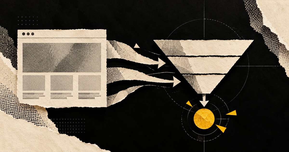
A website is a decision system
A conversion-focused website does more than place a contact form beneath attractive design. It helps the right visitor recognise a relevant problem, understand the proposed value, resolve reasonable doubts and choose a sensible next step.
That sequence begins with positioning. If the business cannot state who it helps, what changes for the customer and why its approach is credible, additional pages and visual effects will only make the uncertainty more polished.
Map the journey before the interface
Map the main audiences and the questions each one brings. A first-time buyer may need education and reassurance, while a referral may want evidence, scope and a direct route to a conversation. Give both a clear path without forcing every visitor through the same funnel.
Design proof around the promise being made. Relevant work, process detail, customer context and transparent boundaries usually support a decision better than an isolated carousel of logos or vague superlatives.
- Define one primary outcome for every key page.
- Place proof beside the claim it supports.
- Reduce fields unless each answer changes the next action.
- Send campaign and page context into the CRM.
Measure progress beyond form fills
Track meaningful steps such as qualified enquiries, booked meetings, product views, completed applications and lead acceptance. Raw conversion rate can be misleading if the form attracts people the team cannot help.
Review what happens after submission as carefully as the page itself. Source data, response ownership and the first follow-up message determine whether website intent becomes a useful commercial conversation.